library(ggplot2)
library(dplyr)
library(reshape2)
# ===================== 数据 =====================
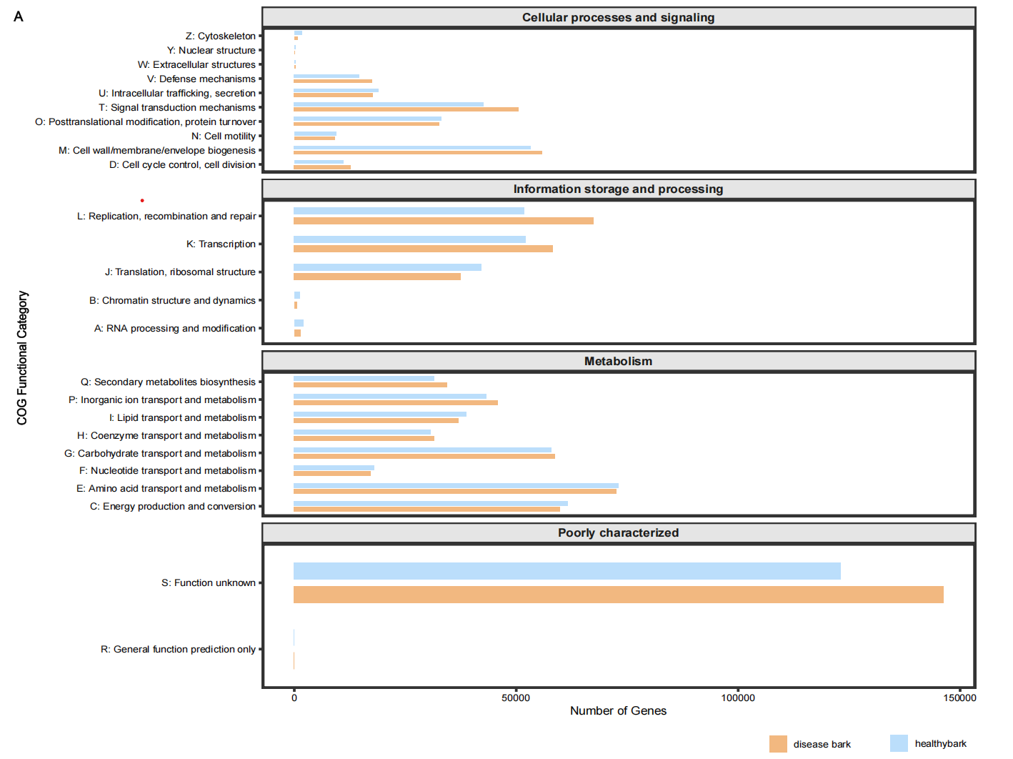
eggnog <- data.frame(
Category = c("A","B","C","D","E","F","G","H","I","J","K","L","M","N","O","P","Q","R","S","T","U","V","W","Y","Z"),
disease = c(1331.92,583.42,59792.40,12647.23,72533.57,17147.12,
58640.01,31475.03,36986.05,37400.36,58142.47,67299.68,
55828.29,9119.68,32528.88,45813.37,34376.89,0,
146233.98,50492.20,17621.21,17423.12,279.45,28.24,766.37),
healthy = c(1979.61,1166.96,61561.81,11042.69,72943.92,17882.83,
57833.78,30585.17,38720.49,42165.03,52066.30,51727.48,
53251.32,9383.54,33073.21,43215.94,31527.85,0,
123054.47,42624.56,18888.27,14535.32,263.66,182.17,1731.78)
)
# ===================== Y轴标签:字母 + 功能名称 =====================
eggnog$Label <- c(
"A: RNA processing and modification",
"B: Chromatin structure and dynamics",
"C: Energy production and conversion",
"D: Cell cycle control, cell division",
"E: Amino acid transport and metabolism",
"F: Nucleotide transport and metabolism",
"G: Carbohydrate transport and metabolism",
"H: Coenzyme transport and metabolism",
"I: Lipid transport and metabolism",
"J: Translation, ribosomal structure",
"K: Transcription",
"L: Replication, recombination and repair",
"M: Cell wall/membrane/envelope biogenesis",
"N: Cell motility",
"O: Posttranslational modification, protein turnover",
"P: Inorganic ion transport and metabolism",
"Q: Secondary metabolites biosynthesis",
"R: General function prediction only",
"S: Function unknown",
"T: Signal transduction mechanisms",
"U: Intracellular trafficking, secretion",
"V: Defense mechanisms",
"W: Extracellular structures",
"Y: Nuclear structure",
"Z: Cytoskeleton"
)
# ===================== 4大功能分类 =====================
eggnog$Class <- case_when(
eggnog$Category %in% c("D","M","N","O","T","U","V","W","Y","Z") ~ "Cellular processes and signaling",
eggnog$Category %in% c("A","B","J","K","L") ~ "Information storage and processing",
eggnog$Category %in% c("C","E","F","G","H","I","P","Q") ~ "Metabolism",
TRUE ~ "Poorly characterized"
)
# 长数据格式
df <- melt(eggnog, id.vars = c("Category","Label","Class"),
variable.name = "Group", value.name = "Abundance")
# 固定分类顺序
df$Class <- factor(df$Class, levels = c(
"Cellular processes and signaling",
"Information storage and processing",
"Metabolism",
"Poorly characterized"
))
# ===================== 最终绘图(无报错版) =====================
ggplot(df, aes(x = Abundance, y = Label, fill = Group)) +
geom_col(
position = position_dodge(width = 0.7),
width = 0.5, # 全局统一柱子粗细
color = NA # 柱子黑边
) +
scale_fill_manual(values = c("disease" = "#F2B880", "healthy" = "#BBDEFB")) +
# 分面:每个分类一个独立框,高度自适应
facet_wrap(~Class, ncol = 1, scales = "free_y") +
labs(x = "Number of Genes", y = "COG Functional Category") +
# 主题:干净边框 + 无网格
theme_bw() +
theme(
panel.grid = element_blank(),
panel.border = element_rect(linewidth = 1),
strip.background = element_rect(fill = "gray90"),
strip.text = element_text(face = "bold", size = 11),
axis.text.y = element_text(size = 9),
legend.position = "bottom",
legend.title = element_blank()
)