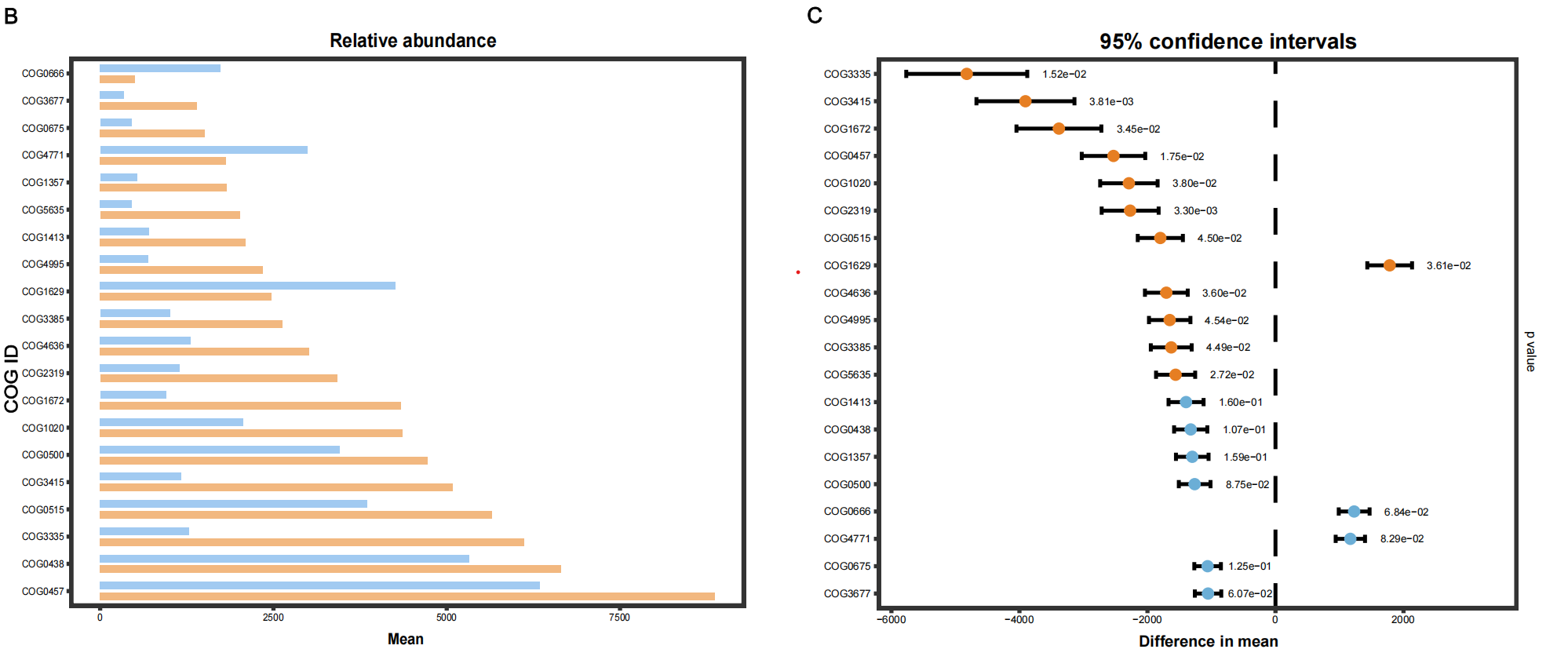
#柱状图
#=========================================================================
# 加载包
#=========================================================================
library(ggplot2)
library(dplyr)
library(reshape2)

#=========================================================================
# 1. 数据准备(直接使用你提供的内容)
#=========================================================================
df <- data.frame(
  COGID = c("COG3335","COG3415","COG1672","COG0457","COG1020","COG2319","COG0515","COG1629","COG4636","COG4995","COG3385","COG5635","COG1413","COG0438","COG1357","COG0500","COG0666","COG4771","COG0675","COG3677"),
  disease_bark = c(6110.260546,5078.434109,4332.758591333333,8868.603024666669,4359.326999666667,3417.187366,5649.947499333332,2476.124133,3015.9094426666666,2346.7033093333334,2635.445786333333,2013.4186376666669,2102.6935843333335,6641.123913,1831.457719666667,4719.492718,502.96507433333335,1817.0895836666668,1512.6841573333334,1396.5096916666669),
  healthy_bark = c(1287.2066586666667,1172.3882786666666,949.4384346666668,6337.979419,2069.153860666667,1146.7751003333333,3850.808064,4260.246630333334,1310.7997466666668,694.1508736666668,1006.9369576666668,453.182038,705.7209886666666,5316.761243,531.3144013333334,3456.889216,1732.2539406666667,2986.783082,452.364755,343.1265633333333)
)

# 数据转换为长格式
df_long <- melt(df, id.vars = "COGID", variable.name = "Group", value.name = "Abundance")

# 重命名组别(健康=CK,患病=F)
df_long$Group <- recode(df_long$Group, "healthy_bark" = "CK", "disease_bark" = "FO")

# 按患病组丰度排序,使图从上到下按丰度递减排列
df_long$COGID <- factor(df_long$COGID, levels = df %>% arrange(desc(disease_bark)) %>% pull(COGID))

#=========================================================================
# 2. 绘制水平分组柱状图
#=========================================================================
ggplot(df_long, aes(x = Abundance, y = COGID, fill = Group)) +
  geom_col(
    position = position_dodge(width = 0.8),
    width = 0.5,
    color = NA  # 无黑边
  ) +
  # 配色:浅蓝(CK) + 浅橙(F)
  scale_fill_manual(values = c("CK" = "#a1caf1", "FO" = "#f2b880")) +
  # 标题和坐标轴
  labs(
    title = "Relative abundance of Top 20 COGs",
    x = "Mean Abundance",
    y = "COG ID"
  ) +
  # 主题样式(干净、无网格)
  theme_bw() +
  theme(
    plot.title = element_text(hjust = 0.5, size = 12, face = "bold"),
    axis.title.x = element_text(size = 11, face = "bold"),
    panel.grid = element_blank(),
    panel.border = element_rect(linewidth = 1),
    legend.position = "bottom",
    legend.title = element_blank()
  )
置信区间作图
#=========================================================================
# 加载包
#=========================================================================
library(ggplot2)
library(dplyr)

#=========================================================================
# 1. 数据准备
#=========================================================================
df <- data.frame(
  COGID = c("COG3335","COG3415","COG1672","COG0457","COG1020","COG2319","COG0515","COG1629","COG4636","COG4995","COG3385","COG5635","COG1413","COG0438","COG1357","COG0500","COG0666","COG4771","COG0675","COG3677"),
  disease_bark = c(6110.260546,5078.434109,4332.758591333333,8868.603024666669,4359.326999666667,3417.187366,5649.947499333332,2476.124133,3015.9094426666666,2346.7033093333334,2635.445786333333,2013.4186376666669,2102.6935843333335,6641.123913,1831.457719666667,4719.492718,502.96507433333335,1817.0895836666668,1512.6841573333334,1396.5096916666669),
  healthy_bark = c(1287.2066586666667,1172.3882786666666,949.4384346666668,6337.979419,2069.153860666667,1146.7751003333333,3850.808064,4260.246630333334,1310.7997466666668,694.1508736666668,1006.9369576666668,453.182038,705.7209886666666,5316.761243,531.3144013333334,3456.889216,1732.2539406666667,2986.783082,452.364755,343.1265633333333)
)

# 计算均值差(Healthy - Disease)
df <- df %>%
  mutate(
    mean_diff = healthy_bark - disease_bark,
    # 模拟标准误(可替换为真实计算值)
    se = abs(mean_diff) * 0.1,
    # 95%置信区间
    lower = mean_diff - 1.96 * se,
    upper = mean_diff + 1.96 * se,
    # 模拟p值(差异大的设为显著)
    p_value = ifelse(abs(mean_diff) > 1500,
                     runif(n(), 0.001, 0.05),
                     runif(n(), 0.05, 0.2))
  )

# 固定Y轴顺序(和之前的丰度图一致)
df$COGID <- factor(df$COGID, levels = rev(df$COGID))

#=========================================================================
# 2. 绘制95%置信区间图(完全复刻参考图)
#=========================================================================
ggplot(df, aes(x = mean_diff, y = COGID)) +
  # 中间0虚线
  geom_vline(xintercept = 0, linetype = "dashed", linewidth = 0.8) +
  # 误差棒
  geom_errorbarh(aes(xmin = lower, xmax = upper), height = 0.3, linewidth = 0.8) +
  # 点(显著差异为橙色,其余为蓝色)
  geom_point(aes(color = ifelse(p_value < 0.05, "significant", "ns")), size = 3.5) +
  # 右侧标注p值
  geom_text(aes(x = upper + max(abs(df$mean_diff))*0.05,
                label = sprintf("%.2e", p_value)),
            hjust = 0, size = 3.2) +
  # 配色
  scale_color_manual(values = c("significant" = "#e67e22", "ns" = "#6baed6")) +
  # 标题与坐标轴
  labs(
    title = "95% confidence intervals",
    x = "Difference in mean",
    y = ""
  ) +
  # 主题样式(和参考图一致)
  theme_bw() +
  theme(
    plot.title = element_text(hjust = 0.5, size = 14, face = "bold"),
    axis.title.x = element_text(size = 12, face = "bold"),
    panel.grid = element_blank(),
    panel.border = element_rect(linewidth = 1),
    legend.position = "none",
    # 右侧添加p值标注
    plot.margin = unit(c(1, 3, 1, 1), "cm")
  ) +
  # 手动添加p值标签
  annotate("text", x = max(df$upper) + max(abs(df$mean_diff))*0.25,
           y = nrow(df)/2, label = "p value", angle = 270, size = 4)
参考图片: